Greetings and welcome to Writerly Wednesdays. Today I thought I'd show you all how I created my cover for Dead Before Dawn: The Vampire Curse. I wanted something effective, but simple. This is a romance, but it also has an element of horror that I wanted to bring out. Hence several of my choices.
Dead Before Dawn, Cover How To
I create all my own covers and if you look you will see that I keep improving and some of my old covers are not so good :). I am slowly replacing these as I go, like I did with all of the Soul Reader series and Charlie Waterman.
One of the important things to remember with eBook covers is that they have to look good big, but they also have to be legible when small. There will be a standard size for every cover on a site, but this is just the biggest it will be seen. It will be resized from anything between that and 80x120. Always test out your cover at its min and its max to make sure you can still tell what it's about.
So the first thing I did was go looking for a good image to use at my background. I wanted to go with the obvious imagery, so I looked for "dawn" on this site:
The images on this site are free to use for any legal purpose without even requiring an attribution. Great resource.
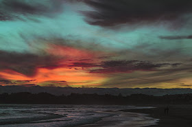
I chose this image:
It is already wonderfully atmospheric and moody and I liked the colour palette.
Next I opened my Photoshop file with the correct sizing. I was making this cover for Wattpad so ultimately it was going to be 256x400 so I decided to work at 400% - 1024x1600 (usually I work at 2000x3000 for a normal cover).
I imported the image above and chose which part I wanted to use for the cover:
At this point I also put on my markers for thirds.
The rule of thirds is simple - you divide your space into three length wise and width wise and then use the thirds as the basis for the layout. This pleases the eye of the viewer, which is definitely what we want. As you can see with this I have the most interesting part of the background image in the bottom third. This article has lots of examples and more information on the rule of thirds.
I knew from the start this cover was going to be title based, that is the title is the most important part. Often my covers have people on them, like The Machine, but it is perfectly valid to go for a title based cover as well.
My most important word - the exciting one in the title, is DEAD, so I knew I wanted that to be big and bold. It had several iterations and actually started as DARK, not dead.
I didn't originally have the the subtitle (The Vampire Curse) on the cover, hence I was going for something to illustrate that, but I decided it was too cheesy. The font I finally chose is Barstarda-K. It has a nice paranormal feel to it, but is easy to read.
The one part I didn't like was the way the small 'd' ends - when it's small I found it hard to read. So I used a layer mask to change it slightly:
The font also has a bevel, a slight gradient overlay and a screening outer glow so that it stands out from the background. I tried a stroke first, but it looked clunky.
Next I moved on to the rest of the title 'Before Dawn: The Vampire Curse'. This I wanted all in the middle third. I started off with the 'Dead' slightly higher and the 'Before Dawn' in the centre, but it felt off balance. So I brought the 'Dead' down and moved the 'Before Dawn' into the left two thirds.
The font is Felix Titling with 140% on the vertical. I used a gradient overlay with colours from the background to link it in with the main design and then used a stroke and a drop shadow to bring it out of the picture.
I used the same font for 'The Vampire Curse' and placed it on the lower third line. I linked it back to the 'Dead' by masking the V of Vampire and replacing it with a V using Bastarda-K.
That just left my name and the Wittegen Press logo. I went with a legible font and chose to place it on the dark area at the bottom to give emphasis to the sunrise happening in the middle of the picture. The Wittegen Logo is standard and all I ever do with that is change the colouring if it doesn't go with the cover.
However, when I looked at it, I didn't think it was quite moody enough. I wanted the focus more on the words and the sunrise. This I achieved by putting in a new layer just above the background which I coloured black. Then I cut out the centre with an oval and used a Gaussian blur (approx 151) to make it less distinct.
It still wasn't quite moody enough, so I added one more layer over the whole thing to bring it together. I used a gradient fill with a dark blue to white value. I made the layer a Multiply layer and then reduced its opacity to 40%.
And that's it, there you have it, my finished cover.
All that remained was the save it for the web at 256x400 and it was ready for uploading to Wattpad.


No comments:
Post a Comment
Thank you so much for reading. I love to hear from people. Please leave your comments below.